This page contains affiliate links. If you purchase through them we may earn a small commission at no extra cost to you. Learn more
Reading Your Solar Monitoring Data: What the Numbers Actually Mean
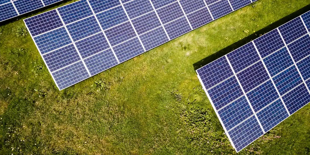
Your solar monitoring app is throwing numbers at you — kW, kWh, self-consumption ratios, specific yield — and it's not always obvious what any of it means. This guide breaks down the key metrics, explains what normal looks like for a UK system, and shows you when a reading is worth investigating.
kW vs kWh — the most important distinction
This trips up almost everyone at first.
kW (kilowatts) is power — how fast energy is flowing right now. Think of it like the speedometer in a car. If your monitoring app shows 2.8kW at midday, that's how much electricity your panels are producing at that moment.
kWh (kilowatt-hours) is energy — how much has been produced over a period of time. That's the odometer reading. If your system produces 2.8kW steadily for one hour, it has generated 2.8kWh.
Your system is rated in kWp (kilowatts peak) — the maximum output under ideal laboratory conditions (1,000W/m² of irradiance, 25°C). Real-world output is always lower than the kWp figure.
If your 4kWp system shows 2.8kW at noon on a partly cloudy April day, that's 70% of its rated peak — perfectly normal for UK conditions.
Why you'll rarely see your full kWp
UK irradiance almost never hits the 1,000W/m² test standard. Even on a clear summer day, you're more likely to see 800–900W/m² of irradiance. Factor in temperature (hot panels lose efficiency), cable losses, and inverter efficiency, and 80–85% of kWp is a good clear-sky result.
What a normal daily generation curve looks like
Your monitoring app's daily graph should trace a smooth bell curve — low in the morning, rising to a peak around solar noon (roughly 1pm BST in summer, 12pm GMT in winter), then falling back to zero as the sun dips below the horizon.
The shape changes dramatically by season:
- June clear day: A wide, tall curve. A 4kWp system might peak at 3.2–3.5kW around 1pm and generate 18–22kWh across the full day.
- December clear day: A narrow, low curve. The same system might peak at 1.2–1.5kW around midday and generate only 3–5kWh for the whole day.
- Cloudy days: A jagged, suppressed curve rather than a smooth arc. Output fluctuates as clouds pass over, and the peak will be much lower — often 20–40% of what a clear day would produce.
If your curve looks like a smooth bell but sits noticeably lower than expected for the conditions, that's a performance question worth exploring. If you see sharp dips in the middle of a clear-sky day, shading from a nearby tree, chimney, or new building is a likely cause.
Daily and seasonal generation expectations
For a 4kWp south-facing system in central England, these are realistic daily generation figures:
Annual total for a south-facing 4kWp system in England: 3,400–3,800 kWh. Scotland expect roughly 10–15% less; the south coast of England may reach the upper end of that range or beyond.
Don't compare summer and winter figures directly
A 4kWh day in December is not a sign of a fault — it's completely expected. Only compare your generation against the same calendar period in prior years, or against regional irradiance data from a source like Sheffield Solar or Solcast.
Specific yield — the fairest performance metric
Specific yield is the number your monitoring app (or a manual calculation) uses to judge whether your system is pulling its weight, regardless of its size.
Formula: Total kWh generated ÷ System size in kWp = kWh/kWp
For example: a 4kWp system that generates 3,600kWh in a year has a specific yield of 900 kWh/kWp.
UK benchmarks for specific yield:
If your specific yield is consistently 15–20% below these figures after accounting for shading and orientation, that's worth looking into — possible causes include a faulty panel, a degraded inverter, or an undetected shading issue.
Self-consumption ratio
Self-consumption is the percentage of your solar generation that you use directly in your home, rather than exporting to the grid.
Formula: Direct solar use ÷ Total solar generation × 100
Typical figures for UK households:
- Without a battery: 30–50%. If you're out at work during the day when generation peaks, your self-consumption will sit at the lower end.
- With a battery: 60–85%. The battery stores the midday surplus and releases it in the evening when you return home.
Higher self-consumption is financially better. Every kWh you use directly from solar avoids buying grid electricity at around 24p/kWh (Q2 2026 price cap rate). Every kWh you export earns only 3–15p/kWh on most SEG tariffs. So using solar yourself is worth roughly 1.5–8x more than exporting it.
Understanding the power flow diagram
Most monitoring apps show a real-time power flow diagram with arrows indicating where electricity is coming from and going to. Here's what to expect:
- Solar → Home (green arrow): Your panels are directly powering appliances. Good.
- Grid → Home (red or orange arrow): You're buying electricity from the grid. This happens when solar isn't meeting demand.
- Solar → Grid (blue or yellow arrow): You're exporting surplus generation. Your SEG meter records this.
- Solar → Battery and Battery → Home: Charge and discharge flows if you have storage.
A healthy midday snapshot on a sunny day might show solar covering all home consumption plus sending surplus to the battery or grid. An evening snapshot might show the battery discharging to cover demand while the grid picks up any remaining load.
Battery state of charge (SoC)
If you have a battery, your monitoring app will show its state of charge as a percentage. A few things to understand:
It won't go to 0%. Battery management systems (BMS) impose a depth of discharge (DoD) limit — typically 10–20% — to protect cell chemistry. So a battery showing 10% is effectively empty from a usable perspective.
It may not reach 100% every day. In winter, there may not be enough generation to fully charge the battery. The BMS may also cap charging at 95–98% to reduce stress on cells and extend cycle life.
Normal daily cycling pattern:
- Morning: Battery sitting at last night's SoC (could be low if discharged overnight, or topped up if you're on a cheap-rate overnight tariff)
- Late morning to afternoon: Battery charging from solar surplus
- Evening: Battery discharging to cover home consumption
- Late night: Either holding a low SoC, or charging from the grid if you're on Octopus Go or a similar time-of-use tariff
Overnight charging from cheap-rate tariffs
If you're on Octopus Go (5.5p/kWh from 00:30–05:30 as of April 2026), your battery should show a charge cycle completing just before 05:30. If it's not doing this, check your inverter's scheduled charge settings — this is a common setup issue, not a hardware fault.
Grid import and export patterns
A healthy daily pattern for a solar-plus-battery household looks roughly like this:
If your pattern looks wildly different from this — for example, you're importing heavily at midday on a sunny day, or you're exporting when you know you're consuming significant electricity — that's a sign something may be misconfigured or malfunctioning.
Warning signs in your data
These are the readings worth paying attention to:
Sudden unexplained drop in generation. If yesterday's generation was normal and today's is 50–80% lower on a similar weather day, that could indicate an inverter fault, a tripped breaker, or a failed string of panels. Check your inverter display for error codes.
Generation drops to zero mid-morning and never recovers. Inverter shutdown — often triggered by a grid frequency or voltage fault, or overheating. Check your inverter's error log.
Battery not cycling at all. The SoC sits at a fixed number day after day. This could be a BMS communication issue, a firmware problem, or a misconfigured inverter setting. Look into your battery manufacturer's app separately from your solar monitoring for more detail.
Export showing while you're consuming. If your monitoring shows you're exporting but you know you're running the kettle and oven simultaneously, your CT clamp (current transformer) may be installed incorrectly or reading in the wrong direction. This leads to your inverter misunderstanding when to export vs self-consume.
Negative readings. Any negative generation or consumption figure is a sensor error. CT clamps are the most common culprit — they can be clipped on in the wrong orientation.
Don't ignore persistent error codes
Inverters log fault codes that often go unread. An occasional grid frequency event (F01 or similar) is usually harmless. Repeated daily faults — especially DC isolation errors or earth fault codes — are worth logging with your installer or inverter manufacturer. Left unattended, some faults cause gradual performance loss rather than a complete shutdown.
Monthly and annual trends
The most useful long-term view is year-on-year comparison. Most monitoring platforms let you overlay the current year against the previous year, or export data to a spreadsheet.
What to look for:
- Gradual decline of ~0.5% per year: This is normal panel degradation. Most panels are warranted to produce at least 80–85% of their rated output after 25 years.
- Sudden 10%+ drop compared with the same month last year: Not normal. This warrants investigation — shading from a new structure or overgrown tree, a panel that has developed a fault, or an inverter issue.
- Consistent underperformance vs installer's projection: If your system is generating 15–20% less than the installer's model suggested, after accounting for actual weather, explore whether the original MCS report matches what was installed.
Comparing your system against others
Two useful external resources for benchmarking:
PVOutput (pvoutput.org) — a community site where solar owners log their generation data. You can search for systems in your area with a similar size and orientation and compare your specific yield against theirs. This is one of the best free tools for sanity-checking your performance.
Sheffield Solar / Forecast.Solar — these services use local weather station data and satellite irradiance to estimate what your system should have produced on any given day. If your actual generation is consistently 20–30% below the estimate for your location, that's a concrete signal to look into further.
You don't need to become a data analyst to own solar panels. But spending five minutes a month glancing at your totals and comparing them to the same period last year will help you catch problems early — before a small issue quietly costs you months of lost generation.
Share this article
Smart home energy monitoring and automation — track your solar generation and control your home with Wi-Fi devices
Affiliate link — we may earn a small commission at no extra cost to you
Stay informed
Get free solar updates direct to your inbox
Related reading
Best Solar Monitoring Apps UK 2026: Every Brand Compared
Solar monitoring app comparison for UK homes. GivEnergy, SolarEdge, Enphase, Huawei, and Home Assistant compared side by side.
Solar App Showing Zero Generation? Fix Your Monitoring
Solar monitoring app showing zero or no data? How to tell if it's a WiFi issue, a data logger fault, or a real generation problem — and how to fix each.
Solar Winter Performance Audit: Underperforming or Just December?
Is your solar system underperforming in winter or is this normal? How to audit your generation data, benchmark against expectations, and spot real problems.

Switch to Octopus Energy
Get 50 credit when you switch. We get 50 too — win-win.
What does this mean for YOUR home?
Design your perfect solar setup in under 3 minutes. Free, no sign-up required.
Build Your Solar System